Game art in Photoshop – Making buildings Photoshop Tutorial
This tutorial by Christian Johansson is broken into two parts. The first part shows how to create the individual buildings for photographs. The second part shows how to construct an entire city for the parts. (Editors note: The upright feature was added into Photoshop CC and is worth looking into for straightening the buildings)
Make the buildings
1. Finding references and textures
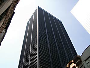
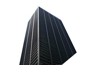
The first thing I do is start collecting as many photos of buildings and city landscapes as possible. I look for textures and references, to get a sense of how a building was constructed and how I can recreate it with Photoshop. For this example I went through my archive of photos taken in New York, Los Angeles, Stockholm and Copenhagen among other cities.
2. Preparing collected assets
When I find a texture that works for me, I begin skewing it and alter its perspective into what it would look like if the building was seen from its front. First then, you have something that is usefull to you. When thats done, I make sure that the image is square.
3. Setting the perspective
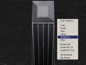
After I have gotten my building’s texture where I want it, I immediately add a square on a layer on top of it, that will serve as roof. I leave it flat and vector looking for now. Then I tweak the buildings front, using the skewing tools, so that the perspective is almost straight from above but with the camera slightly tilted backwards.
4. Adding details

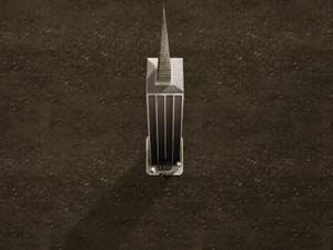
When I have a base that I am happy with I move on and start adding details. For this building I felt like adding a little obelisk to add some interest to the building. I imagined what the vanishing points would be and drew a rectangular vector shape. I then grouped a stone texture I found on google to the vector shape. I also shaded and highlighted it slightly to add some depth.
Further I also added a sidewalk pretty much the same way I added the obelisk. I kept the sidewalks edges straight so that this building could be lined up with other buildings in my city.
5. Define distance with shadows
To make it feel like the building stands out from its background I add a drop shadow in front of the building. A good thing to know about shadows, is that it hints on how tall the casting object is and what it looks like seen from the side or front.
Also, to make the building sit a little better, if you feel like it is floating, is to faintly paint under the pavement with dark brush.
6. Next Step
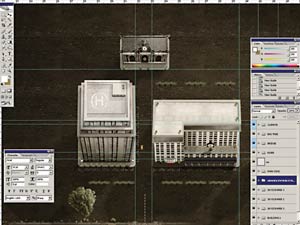
Start drawing a couple more buildings. My library consists of 5 buildings. The more building you can construct and have in your library, the better it is. You city will feel less repetitive. After you have your buildings, start adding details to the streets, like street lines, streetlights, stoplights, parks that divide the lanes etc.
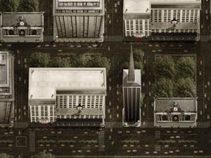
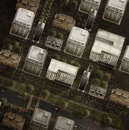
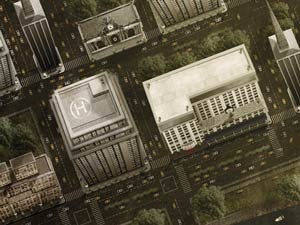
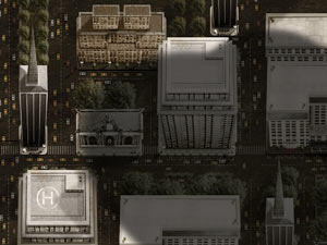
Here is my final result looks like. It took me about 40 hours to build this entire city.

Building the city
This article will show you how to think, in general, and where to start when creating online game art. Some time-saving methods and techniques that define my Photoshop workflow, will also be exposed. This article is not a tutorial, it is written to show the way I work, what methods I use and how I approach a project. The tutorial at the top of the page shows how you can mock up some of the elements I present in my examples.
Preparations
To fully follow this article, it is recommended that intermediate knowledge of Photoshop as well as some sense for 3D and how light and shadows define shapes and areas, is already established.
Creating the art: Planning the scenarios and the environment
Usually when a new game project is started, a scenario for each level is written. Based on each scenario I start collect reference photos for all elements I want to build. For this article I wanted to use a big city as an example. So, I started going over old photos I had taken in New York, Los Angeles, San Francisco, Copenhagen and Stockholm etc. During this process I make textures out of the buildings in the pictures. I look at how the buildings were constructed to get an idea of how to rebuild them in Photoshop. Are there any ornaments on them? Does it have different sections? Gather all sorts of information about the buildings. The more reference, the better off you are.
I also try to pay attention to the smaller details in the photos. What else can be found in a big city more than skyscrapers? Cars, streetlights, small park sections dividing the lanes in the streets, garbage, garbage bins, vendor machines, hotdog stands, dogs and people? Decide how detailed it should be! Without details at all, the city looks too empty and incomplete but on the other hand if there is too much detail it MIGHT look cluttered or you can lose focus on what is really important. Certain details can not be ditched though. For instance cars, they need to be there to make the city feel real and alive. People may be hard to put in, though they would be about 1 pixel tall. Try to figure out what works for you and your project; it is all about balance and what fits with the style of the game.
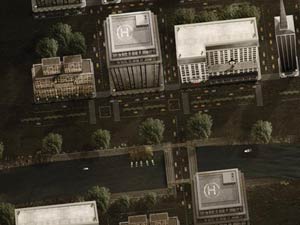
All buildings in this city have textures from real photos, that have been altered to fit with the city’s perspective.
Workflow
Before I start laying the city out, I create an assets library that I call “scene_master.psd.” In this file I organize the art for the different elements into separate layer folders, for a couple of reasons. Mostly just to make it easy to break each element out as a .png, and to be able to alter it later without having to tear my hair out. On top of all the layers in my psd file I stick a folder that I call “Climate”. All necessary adjustment layers, like hue/saturation, curves etc. go in this folder. (Layer group)
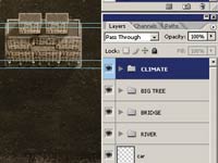
On top of all layers I keep a folder called “Climate” it holds different adjustment layers that alter the look and feel of the city. Cold or warm, day or night.
When breaking it out, I usually duplicate an entire element folder into a new document (Layer>Duplicate layer, make sure document under destination says NEW). Don’t forget to drag the Climate folder into the new document as well. Then I flatten (Layer>Flatten Image) and trim (Layer>Trim) the document and save it as a png file. Make sure that the background is transparent and remember to add one additional pixel to each edge, since Flash for some reason eats the first row and column of pixels.
When all my assets are set up I start laying out the city itself. I put all the flattened pieces of the city into a new document that I call it scene_board.psd. Before I do so, I create a ground texture that will serve as streets between the buildings. It can easily be done by taking a picture of concrete into Photoshop and offset the image (Filters>Others>Offset) by half of the width and half of the height so you can see the edges. When that ís done the Clone Stamp Tool combined with the Healing Brush Tool will help you to make the picture into a seamless texture.
Same thing goes for this file; I try to keep it organized. I put all the flat buildings into a layer folder called buildings while the background textures go into a folder I call Background etc. etc.
In addition to this, I have my own keyboard shortcuts setup. The less motion I need to do with the mouse the better. I hate going into menus looking for actions. I find it very efficient to have shortcuts for, for example, putting a pixel mask on a layer, turning a path into a vector mask and deleting layers etc. etc.
You should, and will, feel what you need to access quick. When you do set up a shortcut for it, it will save you a bunch of headaches in the end.
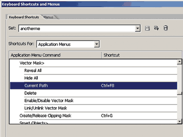
As an extension to the default keyboard shortcuts, I create my own set of shortcuts, for increased efficiency.
Perspective
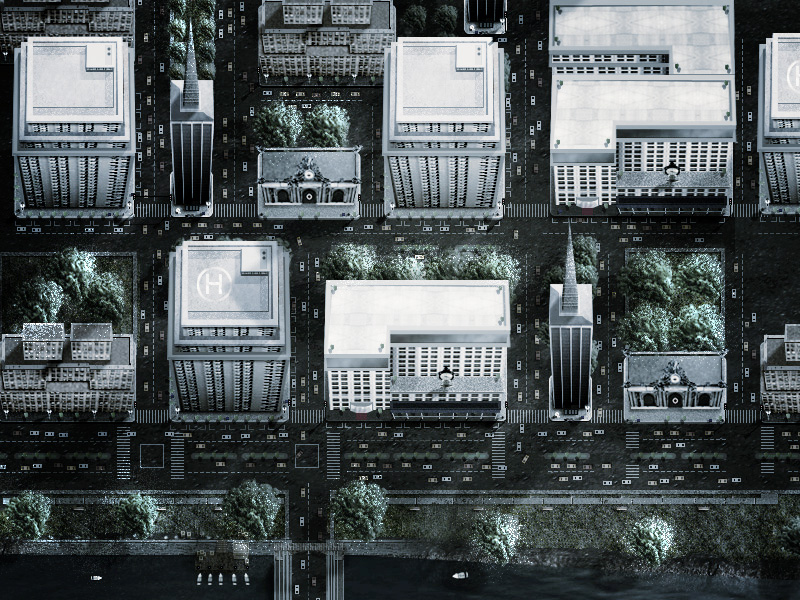
Regarding the platform, in this article I’ve chosen to focus on games that are from a top-view perspective. The problem with a Flash game seen straight from above is that it might look very uninteresting and flat. The way around that are to rotate the view a little and slightly expose the front of the elements you’ve chosen to build. I do this for prominent elements in my scene like buildings and even smaller objects that are not rotateable on the Y axis (from above and down) in the game. A car for instance, I would not expose any of its sides or front, unless its shape was round. Because when you rotate it, it will not match with the overall perspective of the scene. The front of the building is being exposed although it’s a top view perspective.
I slightly shape the exposed front of the buildings, in a triangular shape so that it starts wide and gets narrower at the bottom. The result is that each building will have its own vanishing point, rather than that the entire city having one common VP, which it would in reality. That is as close we get with a fake 3D perspective.
For the sidewalk, though, I keep it straight horizontally and vertically so it can tile with other buildings and to define the streets.
Once again, the scenario should come into consideration. What is important with the game? What needs to be shown? Maybe another perspective, other than top-view, helps telling the story of your game better? Maybe it should be isometric or 3rd person instead?
Lighting and shading
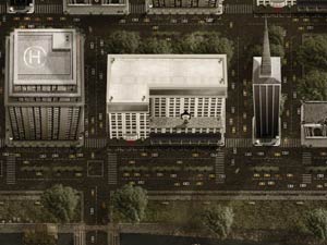
This example illustrate how shadows can add interest to an image.
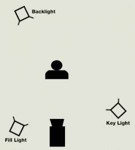
Another vital part in creating a board is that a global light source is predefined. Meaning, all shadows point in the same direction for instance. When using textures from different photos with different lighting, make sure to retouch them so they somewhat match up with the light source. A city that is key-lit from 3 or 4 different directions is going to look pretty weird and unnatural. I try to think of a technique that is base for lighting a 3D scene, called 3-point lighting.
3-point lighting is a light setup consisting of three types of light; key light, fill light and back light. Key light is the main light source, like the sun or a lamp for instance. In a 3D application the light doesnít bounce which it does in reality, meaning the backside of the lit element is 100% dark and detail is lost in this area. That is what I use the fill light for, filling in some of the lost details. Finally the backlight, it serves to define the overall shape of the lit object some more and makes it stand out from the image’s background a little bit. I don’t follow this method obsessively when I work with a 2D piece, but I like to think of why the method was invented.
Light and shading can make you’re scene look very interesting too, with proper use. There is allot that can be done. Shadows, for instance, help define distance. It also helps define the shape of the buildings in my city. Since it is seen from above the spectator gets no information about what the building looks like from the front or the side. This information can be given by the buildings drop shadow, which is telling us how tall the building is as well. Same thing for light, in a dark scene, light can tell the story of, for instance, a window that is placed somewhere in the scene where you can’t see it. It would add interest to the scene and you would start imagining what the environment really looks like.
Prologue
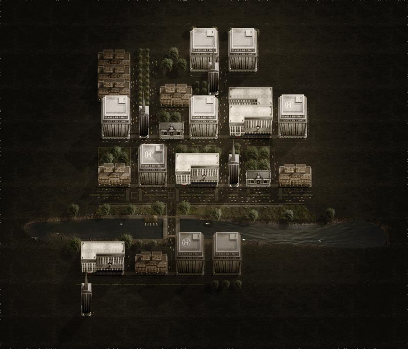
The final result of the city.
Review
We have now gone over where to start, how to think and what to be thought of when planning your scenarios. Some of my knowledge on lighting and shading has been given to you, as well as some tips on how you’re workflow could be improved.

Understand that this is how I approach these types of issues; it might not be what fits you, it’s just a suggestion.
ActionMake sure you find the psd’s that came with the zipfile. They can show you further how I did some of the elements in my city.
Please find all the included psds in this download
Examine them and play around with them, see what you can get out of it. If you’re less experienced with this, try to pick my stuff apart and understand how I built it. Practice a lot and don’t give up. It might look crappy in the beginning; it does for me too sometimes. Take a second and think of why it doesn’t look right, sometimes it’s all trial and error until you’re pleased with the result.
Questions?
My e-mail is c[email protected]. If you have questions or wanna discuss the matter Ill try to get some time over and be available for answers. Good luck and have fun!
Christian
About the author
Christian Johansson is a New York based graphic designer originally from Sweden. With a background and training at Hyper Island, School of New Media and a full time design position at Big Spaceship, New York, he has now been a professional graphic designer and animator for about 4 years.
During his time with Big Spaceship he has developed several online games for diverse clients, among others, Paramount and Sony Pictures.
PS Don’t forget to follow us on Social Media for more tips.. (I've been posting some fun Instagram and Facebook Stories lately)
You can get my free Layer Blending modes ebook along with dozens of exclusive Photoshop Goodies here

How to make Silky metal edges and a bubbly shiny glassy text in the free Photoshop Tutorial.
How to add a background blur to a Photo in Photoshop. Learn to make a blur mask / depth map...

How to do high end color grading instantly with gradient maps. This Photoshop tutorial shows you how to quickly get...