PhotoshopCAFE Design Challenge 7 Billboard, past or Future


PAST or FUTURE: Enviromental Design! Design a billboard!
Make a billboard ad for Photoshop in the past or future, could be caveman days, colonial, 60s or future, you decide. Use any original artwork you desire. You may use any tools or platform you choose, but you must use Photoshop for at least 50% of the Image editing/design.
Sponsors
Adobe Systems | Wacom | Logitech | PhotoshopCD| Strata| e frontier| AutoFX Software | NIK Software | Vertus| Medialab| Worth 1000
onOne Software | Lensbabies| Alienskin software| Graphic Authority | Expoimaging| Action FX| Tivity Software | Insider Software | AV bros|
Winners and Finalists

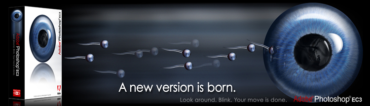
1st Place :: Olie
Colin: Another strong concept. Love the hand tearing through the cloud.
Oliver: LOVE IT! Concept and style, neat neat neat.
Avi: Genesis was spelled incorrectly, but the concept and execution makes it so easy to overlook. I love how the clouds clear away from the hand. The movement looks very fluid.
2nd Place :: yulhenki
Colin: Clever and witty. Nicely drawn with a consistant style.
Oliver: same as above.. the theme is very nice. Consistent work and content-wise maybe even the best one here.
Avi: Wonderful concept. I’d love to see this one cell shaded without borders. That’d give your work an even more stone feel. I love it regardless though.

3rd Place :: dug
Colin: Clean and simple. Is this the birth of bio-electronics?
Oliver: Love the idea, love the execution. Neat Idea, nicely done. Good design idea and it all just fits. Wording is nice, I would love it as real world billboard.
Avi: The concept is nice, but I lose the Photoshop specific feel to this. I try to look at these images and feel as a viewer a message about Photoshop itself and the CD and the document on the paper threw me a bit. I do love the use of colors though. As Oliver said, it would look beautiful as a real billboard.
4th Place :: jovan
Colin: Very clever, clean and the image says it all with good supporting slogan.
Oliver: Overused idea but very good and nice take on it. Claim is neat.
Avi: This is clean, sleek and professional. Although I might need to wear Latex gloves the next time I pop in the Photoshop CD. Brilliant!
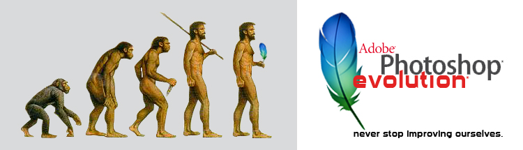
Top 10 Runner-up :: carnage21
Colin: Nice take on the classic evolution image
Oliver: Second that. The feather in his hand – wohoo funny. I’m not too happy with the type “never stop…” – not sure if it’s the position or the fact it’s black and looks too bold.
Avi: I’ll differ in that while this is a nice idea, it seems a bit too generic and easy to reuse this evolution image for any company. Replace the feather with a starbucks coffee cup or a Lexus logo and there’s no change at all. To be clear, my problem is that the image is a famous one. Had it been redone or handrawn in Photoshop in a way that makes it unique to Photoshop, I think it’d be fantastic.
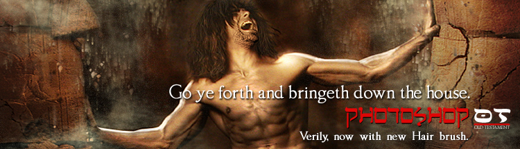
Top 10 Runner-up :: dogtrombone
Colin: I like the creativity in this one. Very witty and the illustration is amazing.
Oliver: Not chosen by me but I had a good laugh @ the hair brush idea. Then again the spacing between the words is strange?
Avi:I loved both your Biblical themed entries, and this was the better of the two. The visual is quite powerful (no pun intended) and the pun on Samson’s hair is hilarious.
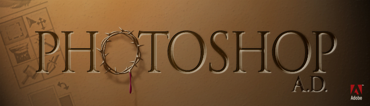
Top 10 Runner-up :: jabergr
Colin: This is clever, with the redone tools in the toolbar.
Oliver: Wohoo! Neat idea, neat execution. That’s how advertimsent should be. The theme itself is of course not political correct. But, I don’t care, I’m from Europe
Avi: Wow, this is definitely attention getting. I LOVE the subtle cross on the move tool.
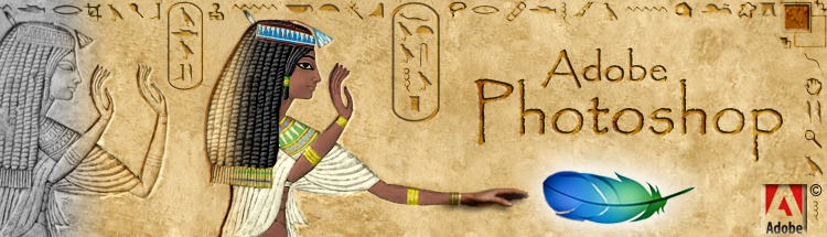
Top 10 Runner-up :: TCcreative
Colin: There were several Egyption themed entries. To me this was the best. It has impact, well executed and I like how the tools are turned into hieroglyphics. The transition into color and the 3D hand show the power of Photoshop back in the BC days.
Oliver: ROFL @ toolbar icons. Nicely done. Hand and feather.. yesss.
Avi: This is beautiful and clever. The heiroglyphics are wonderful and your shift from engraved stone, to painted, to 3d is wonderful.

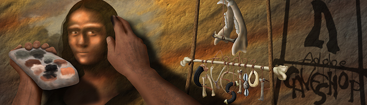
Top 10 Runner-up :: Warmodder
Colin: Simple and effective. Tool bar is clever.
Oliver: This one REALLY made me laugh, I would take a photo and show it to my wife as good adevrtising is exactly this. There are better entries and the execution (toolbar icons man!!!) is not the best here but then again the wording… yesss!
Avi: The tagline is clever, but what is the image supposed to be of? A cave wall with a toolbar on it? I am not sure I understand the message here or maybe I’m just not understanding it from the point of the target audience (cavepeople)?
Top 10 Runner-up :: ZeleniZub
Colin:Very well done, looks very convincing.
Oliver: Very nice idea, maybe too subtle for a real world ad? execution is well done!
Avi: Clever idea that uses a metaphor nicely to illustrate Photoshop’s power.
Honorable Mention :: RandyToons
Colin: This is a very strong concept. Really using the theme well as well as amazing illustration skills.
Oliver: Mega stylish, love it. Had a very goopd laugh when I saw the feather. Man, good work!
Avi:Hilarious idea and execution. I love the expressions on the characters. My only critique would be that the colors don’t pop for a billboard ad
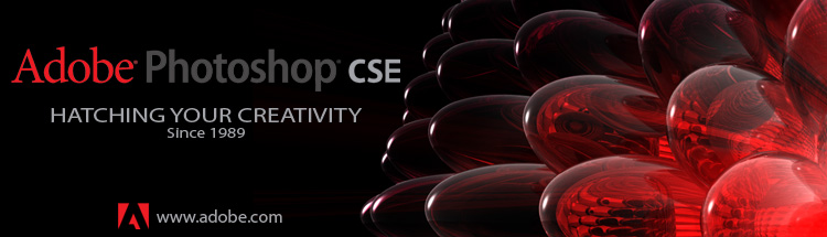
Honorable Mention :: spdfreak_95
Colin: This piece has so much impact, it just looks great. The reflections on the glass eggs is very well done.
Oliver: Like he said. What is CSE? Enhanced? Why not explain it? The highlights of the things in the background are a bit bright maybe.
Avi: I like the balance here, and the shift in opacity of the eggs.

Finalist :: cameron913
Colin: This entry has a nice flow to it. Colors are clean and it feels very organic.
Oliver: Neat idea – exceution is grand – of the logo. Just the black scribble behind the “change everything” is not consistent, what a pity.
Avi: I like the rough feel to this. I think had the scribble behind change everything actually formed the words (instead of overlaying them), it would have fit nicely.

Finalist :: cfire
Colin: A lot of intricate Photoshop work here. Good period piece.
Oliver: If all that is done in PS, wonderful work! The type fits the theme but is overall a bit too much to make a good advertisment.
Avi: Really great imitation of Ye Olde advertisements. I love how the old machinery has an iPod like dial with vibrant colors. Nice work!
Finalist :: jac
Colin: Really good imaging, what more can I say?
Oliver: Yes, it’s nicely done but I completely miss the advertising idea and the meaning? Why is “the future here”? How do I see?

Finalist :: Krupman
Colin: This has been done will with a lot of detail and good effects. Just a little bit busy.
Oliver: i Don’t get the main idea. Effects-wise it’s overdone. Unfortunately.
Avi:I love how this entry gives a nice sampling of a range of effects. seeing the transparency grid on a real stage makes this one even more powerful. Great work!
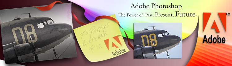
Finalist :: Mathew
Colin: I just like the imagery on this. Well balanced, good use of perspective. Speakers do seem a bit out of place though.
Oliver: Hmm. Overused and, as for today, kinda old style for promoting a future product? No. I Don’t get the speaker idea btw.
Avi: I love the balance and calligraphic flow of the ink in this. It almost looks organic, or like that Venom symbiote from the Spiderman 3 movie.

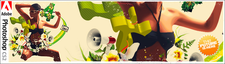
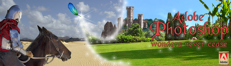
Finalist :: Olie
Colin: This just jumps out at you, great concept and it looks like a billboard that would make you look at it.
Oliver: Unfortunately she’s not someone I would like to see on a billboard. It’s nicely done just doesn’t touch me.
Avi:Nice work! The special effects you added to this are what sold me on it.
Finalist :: PNeal
Colin: The shadow on the wall is just brilliant. 100% Photoshop work too.
Oliver: The shadow on the wall is just brilliant. The idea is brilliant. Unfortunately (!) the overall composition doesn’t make a billboard I’m afraid.
Avi: Wow, this is a wonderful photo illustration. The detail you put into it is astounding and you should be proud.
Finalist :: Bryan
Colin: Nice painting work on this, although it doesn’t look like a billboard to me and I fail to see how it follows the theme.
Oliver: As Colin said, like it, good job but not following the theme.
Avi: Very subtle and powerful. I think some wording would have helped (as it’s not clear that your message is “paint your fantasy” from the image alone,) but wonderful nonetheless.
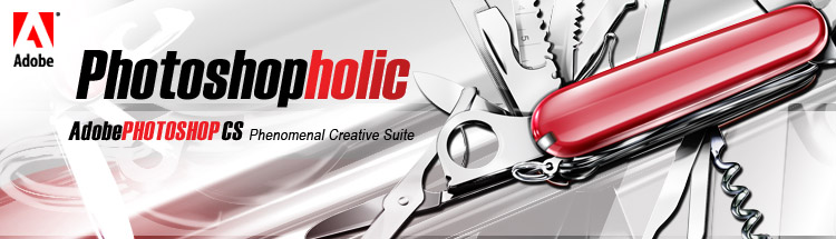
Finalist :: PungKiez
Colin: Really good Photoshop skills are shown here as well as a good composition. Good clean, easy to read text.
Oliver: is the knife drawn in Ps? Really? Not just retouching? I like the concept.
Avi:Clean and great use of contrasting colors. The use of a swiss army knife as a metaphor for a tool that does everything is a nice touch.

Finalist :: rAyVoLvEz
Colin: A lot of detail in this one, but yet still stands out as a strong enough compostion to attact the attention of a passerby.
Oliver: Like he said. I can’t completely follow the description in the forum post but still it’s good work. If I would like to see it as billboard? Hmm, no,
Avi: You put a ton of work into this, and I agree with Colin and Oliver: it’s a bit too much for a billboard. I’d still hang it on my wall though.
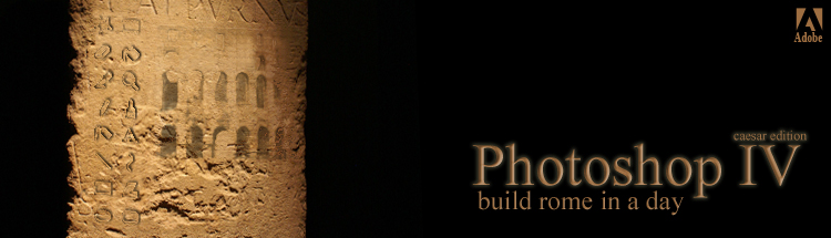
Finalist :: rob_247
Colin: This is a simple piece, but has impact and captures the theme well.
Oliver: Idea is nice. Execution is nice. I think you ruined the “rome-built” idea as the claim makes no sense. What a pity. The usage of the tolbar icons is very clever.
Avi: The idea is nice, but the balance feels a bit off. There’s a bit too much harshness between the jump from light to dark. Introducing gradients or a more organic background would have helped this.

Finalist :: snardarcandybar
Colin: A good period piece. Good use of the theme. Colors, illustration and textures are well done.
Oliver: Good use of theme but not easy to read so not ad-worthy.
Avi: It has an authentic antique newspaper clipping feel to it, but as a billboard I am not certain it would be legible. Great work on aging it. I’d love to learn your technique!
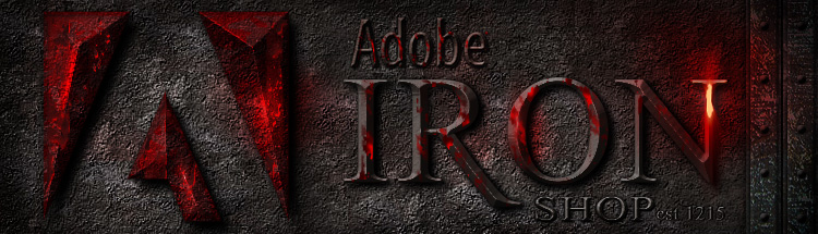
Finalist :: spdfreak_95
Colin: I like the play on words. Ironshop. The textures are extremely well done.
Oliver: Don’t try this on a billboard if you want ppl to read it. But the again a nice design.
Avi:What a fantastic concept and execution! The image really feels like it’s glowing, and the idea of a metal forge is a great parallel to Photoshop.

Finalist :: emm
Colin: I like the way this captures the different eras of past to future, with a cultural element.
Oliver: Nothing for me. The PS work is okay and clean just the theme and pix chosen are kinda boring. The type is nothing you would be able to read in real world.
Avi: The idea behind it is nice – I like advertisements with a message – but the image is a bit too busy. For example, the effect of putting black text on a clear backdrop doesn’t really have the intended effect The biggest thing that stood out to me was the red adobe logo written on a blue sky. That contrast is too harsh and draws the eye above the other imagery on the right side.

Finalist :: hmdqdrshk
Colin: Simple and effective. I know people are supposed to know it’s Photoshop by the feather, but since it’s past or future, a logo or wrting Photoshop somewhere would have helped.
Oliver: This is nice in looks but what should it be? A teaser campaign? Nobody knows that this is meant to be photoshop not even adobe…
Avi:This entry highlights just how important the Keep It Simple rule of design is. You didn’t need to do a lot of work on this image to make it work, but what emerges is such a powerful visual that you and the Photographer both deserve special recognition.
Finalist :: ICM
Colin:A lot of good work in this one. Although I would like to see it a bit simpler and the text stronger for a billboard.
Oliver: Work is okay on this one but doesn’t touch me. Sorry.
Avi:This ad is quite subtle, but depicts Photoshop’s power in such a great simple way. The movement of saturation from left to right is a fantastic way to draw the eye across the story in the picture.
Finalist :: TCcreative2
Colin: I just love the feather magically changing the desert into an green kingdom.
Oliver: Yes, no. Don’t know. Well done yes, but advertisment no. PS Work is good no doubt.
Avi: I like the idea, but the artwork itself doesn’t seem to match. The horizons are not matched up correctly and it harms the illusion.
\ 8 \ 9 \ 10 \ 11 \ 12 \ 13 \ 14 \ 15
Thanks to The Sponsors…
Adobe Systems | Wacom | Logitech | PhotoshopCD| Strata| e frontier| AutoFX Software | NIK Software | Vertus| Medialab| Worth 1000
onOne Software | Lensbabies| Alienskin software| Graphic Authority | Expoimaging| Action FX| Tivity Software | Insider Software | AV bros|
The Judging…
1. Overall impact 40% of score
2. Concept 30% of score
3. Graphics skill 30% of score
The Judges: Colin Smith, Oliver Ottner, Avi Muchnick
The Rules:
The Specs…
215 pixels high x 750 pixels wide. Front of billboard only, do not make a 3D display, just show the design.
template here
Post entries here
The Rules…
2 entries allowed per contestant
Anyone may enter (except judges)
All entries to be posted on server at cafe (link) no later than midnight PST March 1st, 2007.
Good luck!
View entries here
No pirated or ripped images are to be used. If you are caught ripping for the contest, you will be banned from all future contests at the CAFÉ.
No pornography or profane language will be accepted.
No political or racial imagery allowed.
Judges decision will be final and no argument allowed.
The Prize Value: $11,799 (so far)
Grand prize $7,123 worth (so far)
The winner will be featured on the PhotoshopCAFE homepage.
Adobe Creative Suite 2.3 Premium Adobe Systems
Includes: Photoshop CS2, Illustrator CS2, InDesign CS2, Golive CS2, Acrobat 7 Professional, Bridge, Adobe Stock Photos and Version Cue $1,199.00 Value
Wacom Intuos3 6×8 Pen tablet $329.95 value ![]()
Strata Suite Strata 3D CX, Strata Foto 3D, Strata Live 3D $1695 value
e frontier Poser 7 $249.99 value
Shade 8 Standard $199.99 value
Anime Studio 5 Pro $199.99 , Manga Studio 3.0 EX $299.99
OnOne Suite (Genuine Fractals 4.1, Mask Pro 4, PhotoFrame Pro 3, Intellihance Pro 4)
OnOne Software $399
Color Efex Pro 2.0 Complete edition Value $299.95 NIK Software inc.
Lensbaby G3 LensBabies $270
SiteGrinder Pro – Media Lab $249 value
Xtivity and Pixtivity Bundle Tivity Software $129.00 Value
NuLOOQ navigator $79.99 Logitech 
Expo Disc Expoimaging $99.99 
Vertus Fluid Mask2: Value $199 
Mystical Edge Bundle Mystical Lighting and Photo/Graphic Edges 6.0 Value $299 
Graphic Authority Library (Photo Edges, Frames, Brushes, Backgrounds) $179.99
PhotoshopCAFE Guru Bundle training CDs Value $140.00
Alienskin Exposure $199
Font Agent Pro 3 and Smasher Insider Software Value $149.90
Page Curl and Puzzle AV Bros Value $79.99
WildPOP Vector Characters: PixoPOP $279
(Exclusive to PhotoshopCAFE Get them for $79 here)
500 Worth 1000 Credits $50 Value
2nd place Value $2528 worth (so far)
Strata CX Pro Strata $695 value


e frontier Poser 7 $249.99 value
Anime Studio 5 $49.99 and Manga Studio 3.0 Debut $49.99 value
NuLOOQ navigator $79.99 Logitech
Dreamsuite Series 2 AutoFX Value $149.00
Vertus Fluid Mask 2: Value $199
Color Efex Pro 2.0 Select edition Value $159.95 NIK Software inc
Alienskin SnapArt $199
WildPOP Vector Characters: PixoPOP $279
(Exclusive to PhotoshopCAFE Get them for $79 here)
Pixtivity Tivity Software $79.99 Value
SiteGrinder Basic – Media Lab $129 value
Photo Ornaments and Frames Graphic Authority $49.99
350 Worth 1000 Credits $25 Value
Action FX 1 year membership Value $49.95
Page Curl and Puzzle AV Bros Value $79.99
3rd Prize $2,150 worth (so far)
Strata CX Pro Strata $695 value
e frontier Poser 7 $249.99 value
Anime Studio 5 $49.99 and Manga Studio 3.0 Debut $49.99 value
Vertus Fluid Mask 2: Value $199
Xtivity Tivity Software $79.00 Value
AutoEye AutoFX Value $129.00
Color Efex Pro 2.0 Standard edition Value $99.95 NIK Software Inc
NuLOOQ navigator $79.99 Logitech
Weathered Backgrounds and Brushes Graphic Authority $49.99
WildPOP Vector Characters: PixoPOP $279
(Exclusive to PhotoshopCAFE Get them for $79 here)
PSD 2 FLA – Media Lab $89 Value
Page Curl and Puzzle AV Bros Value $79.99
150 Worth 1000 Credits $15 Value
4th place
Antique Papers Graphic Authority $49.99
Runners up
4-10th places: 50 Worth 1000 Credits $5 Value
Posting instructions…
To attach your entry:
1. Click the back button to return the the main contest thread
2. Choose New Topic
3. hit the “choose file” button on the bottom of the page.
4. Navigate to the file on your Computer..
and upload
Don’t forget the entry 215 pixels high x 750 pixels wide at 72ppi. Optimized and saved as a jpg or gif. No exceptions. Failure to abide by these guidelines will result in instant disqualification.
One more thing… no sigs on the entries please – You may comment on the Creation process this time. Ie 100% Photoshop, or if you are the photographers, photo credit etc.
PS If you want to change your entry, you will need to delete it first and then post a new one
Good luck all!
Colin
\ 8 \ 9 \ 10 \ 11 \ 12 \ 13 \ 14 \ 15

Design challenge 5, design a movie poster. Premium Photoshop design contest at photoshopcafe.com. Free to enter, win lots of valuable...
The Challenge… Design a CD Cover for a Photoshop Effects, Training Video. Must include PhotoshopCAFE and any original artwork you...

Design challenge 6, design a cereal box. Premium Photoshop design contest at photoshopcafe.com. Free to enter, win lots of valuable...